


Responsive Design in 2025: What’s New and What Still Works
In the ever-evolving digital landscape, responsive web design remains crucial for businesses striving to create seamless user experiences across devices. As we enter 2025, web design is undergoing significant transformations, integrating new technologies while maintaining best practices that have stood the test of time. Whether you’re a business owner, a developer, or seeking website development services in New York, understanding the latest trends in responsive design can set you apart from the competition.
The Evolution of Responsive Design
Responsive design emerged as a necessity when mobile internet usage surpassed desktop browsing. Today, it is no longer just about fluid grids and flexible images; it encompasses an adaptive, AI-driven, and immersive approach to user experience. With the increasing adoption of foldable screens, wearable technology, and voice-based navigation, websites must now cater to more diverse user interactions than ever before.
What’s New in Responsive Design for 2025?
1. AI-Powered Adaptive Design
Artificial Intelligence (AI) is revolutionizing how websites respond to user behavior. Modern websites can now analyze user preferences in real time and adapt layouts dynamically to enhance engagement. For example, AI can automatically adjust the site’s design elements without manual input if users prefer larger fonts or dark mode.
2. Variable Fonts for Better Readability
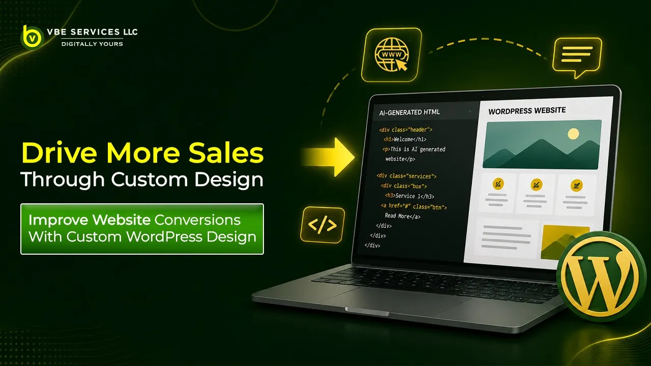
Typography plays a crucial role in user experience. Variable fonts allow for smooth transitions between different font weights and styles, leading to improved readability on various screen sizes. Websites designed by top web development companies in New York, such as VBE Services, now leverage this technology to enhance user experience without compromising performance.
3. Foldable and Multi-Screen Device Compatibility
With the rise of foldable smartphones and dual-screen devices, web developers must create layouts that adjust seamlessly across these new screen formats. This means designing websites that function equally well when viewed on a compact screen as they do when expanded to full tablet mode.
4. Voice-Optimized User Interfaces
Voice search and voice-activated browsing are becoming mainstream, thanks to smart assistants like Alexa, Google Assistant, and Siri. In 2025, businesses will prioritize voice-optimized UI elements, ensuring users can navigate sites hands-free. Web development companies in New York are increasingly incorporating voice-friendly interfaces into their responsive design strategies.
5. Motion UI for Engaging Experiences
Micro-interactions, animations, and Motion UI elements provide an engaging browsing experience without overwhelming the user. These subtle animations guide users through the interface, improving usability while adding a touch of sophistication.
What Still Works in Responsive Design?
While new trends enhance responsiveness, some core principles remain essential:
1. Mobile-First Approach
With mobile users dominating web traffic, a mobile-first design remains fundamental. To cater to on-the-go users, websites must prioritize fast load times, easy navigation, and touch-friendly elements.
2. Fast Loading Speed
Performance optimization continues to be critical. A delay of just a few seconds can increase bounce rates significantly. Optimizing images, leveraging lazy loading, and using efficient coding practices are still best practices in responsive web design.
3. Fluid Grids and Flexible Images
The foundation of responsive design—fluid grids and flexible images—ensures that layouts adjust seamlessly across screen sizes. This methodology continues to be a core component of website development services in New York.
4. Cross-Browser Compatibility
Even in 2025, different browsers render web pages differently. Ensuring that a website performs consistently across various browsers remains a necessity.
5. Accessibility Compliance
Web accessibility standards, such as WCAG guidelines, are more important than ever. Responsive design must consider users with disabilities by incorporating screen reader compatibility, high contrast modes, and keyboard navigation.
Choosing the Right Website Design Company in New York
For businesses looking to create cutting-edge responsive websites, partnering with an expert website design company in New York is essential. Companies like VBE Services offer top-tier website development services in New York, ensuring that businesses stay ahead in the competitive digital landscape.
Final Thoughts
As responsive design evolves in 2025, balancing innovation with tried-and-true methodologies is key to success. AI-driven adaptability, voice optimization, and foldable screen compatibility represent the future, while mobile-first strategies, fast load times, and accessibility remain the foundation. To stay ahead, businesses should collaborate with the best web development services in New York, ensuring their website is both future-proof and user-friendly.
If you're looking for a top web development company in New York, consider VBE Services for cutting-edge, responsive website solutions tailored to your business needs.